How and When to Style a Kitchen Island
Your kitchen island should be the most function-focused area in your home. They’re too expansive of a space to be ignored in a design plan, and should 100% be beautiful. That said, you need to look at the desired functionality of the space. Is the goal to include four or five seats off the back of the island to service the family’s breakfast needs? Is it to layout a spread when you entertain? Or does another area take that role, leaving your island clear to be a decorated space with a decorative plan? You must narrow down the desired use of your kitchen island in order to decide what level of decoration it needs.


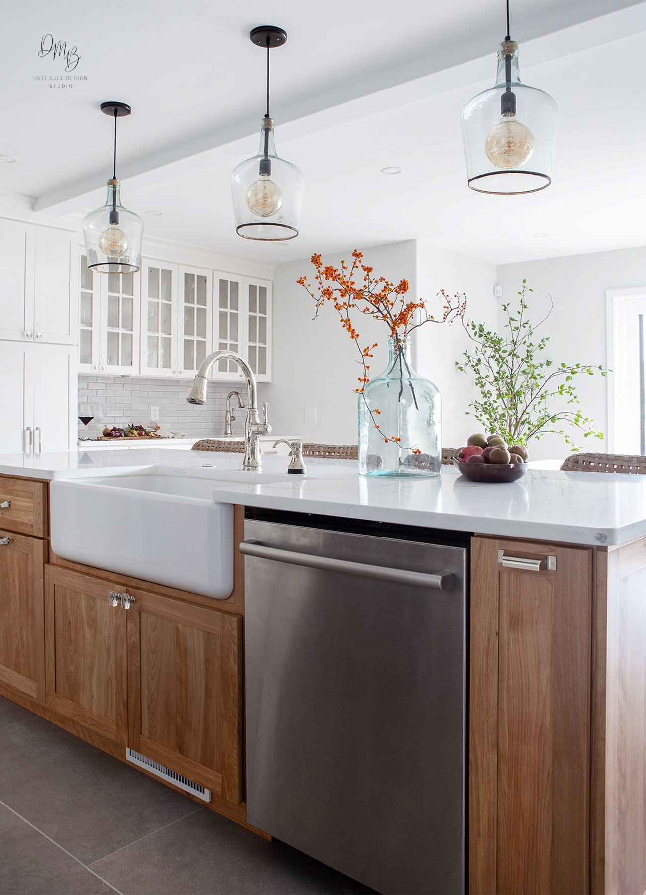
With that said, much of the styling we do on the island is just for looks and photos. It’s a trade secret that isn’t that big of a secret. A large part of decorating your island will only be done contextually, when you’d like a specifically pretty space. When we’re composing our spaces for a photoshoot a small touch of decor is appreciated. If you’re looking to use your island primarily as a food prep space, it’s usually best to keep it decor-free to avoid clutter. The last thing you want is an element used only in service of aesthetics getting in the way of breakfast or bill payment. In the Carraway Renovation we didn’t want to distract from the beautiful quartzite countertops. If you’ve made a countertop selection that makes a statement, give it the space to attract!
If you do wish to decorate your island, I find the countertop often looks best when cleared of anything nonessential. It obviously depends on the space and where else the design is drawing your eye, but the unencumbered functionality of this look is very beneficial. When we do choose to style, it will be with decor that contributes to the function of the space. This is one of the reasons that every level of selections bears importance. Choosing an artistically coordinated array of paper towel holders, aesthetically-pleasing towels, and perhaps a tasteful fruit bowl keep your island from appearing empty. These add practicality, particularly if your island includes a sink.


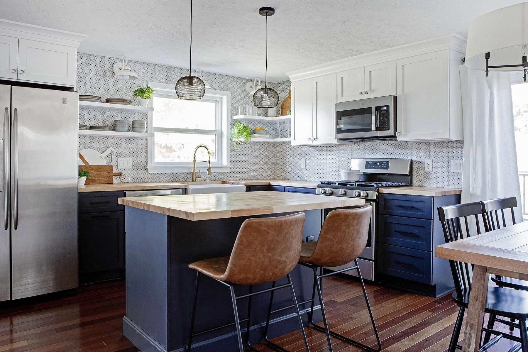
As you can tell from our photos, when we style we always want to draw the viewer’s eye to the particular strengths of the space. For the Cascade Renovation I chose to use a light touch while decorating to avoid distracting from the absolutely gorgeous backsplash. When styling in circumstances like these, we’ll usually try to fill the space with one large item, often a plant or floral display. This adds a vital pop of color, and a festive touch when planning to host a party or entertain for the holidays. Make sure that whatever you choose compliments your background color scheme, and maintains a consistent palate.


Usually only one or two items like a fruit bowl or display of greenery will give you enough of a visual impact without distracting from your background. If you were planning for a get-together and you want the island to be a counterpoint, I’d increase the size of the arrangement to ensure proper scale. Again, it’s all about where you’d like your viewer’s eye to fall. Entertainment gives you an opportunity to make the most of platters and bakeware. I recommend that you give each counter space a specific function when planning a party. I create separate zones for different courses or types of cuisine, allowing intentional curation to make the evening’s meal a part of the decor.


